|
by Bobic of 4sceners.de and Axel of Brainstorm
|
Download the pdf here
Most modern games are visually impressive these days. While most of them have a similar appearance, such as games based on the Unreal engine, some truly stand out and take a different visual path. Sometimes they even have a style or visual approach that was unseen before. People who know the demoscene are aware that the creative minds in the scene are always looking for new ways to present visuals. Sometimes, certain effects seen in a game remind us of some of the great demos out there. ZINE lists a couple of games that might be raising the interest of the dedicated demoscener. Please take this with a grain of salt, as the list isn't too serious.
Title: Mirror's Edge Platform: PS3, 360, PC
Developer: Digital Illusions
Year: 2008
Explanation: Cold and sterile appears the world in which Faith is active as a freerunner. She bustles through street and canyons and over rooftops acrobatically making use of everything the world offers to her including tubes and guard railings. These are displayed in bright red, thereby standing out of the dull environment. This offers so much charm that the game is comparable to Black Maiden's "Diego on E" or "Exospect" as well as "Above" by LKCC.

Title: The Chronicles of Riddick: Escape from Butcher Bay Platform: PC, Xbox
Developer: Starbreeze
Year: 2004
Explanation: Even the options menu already warms the heart of every demoscener. The very stylish cube could come straight out of a demo and surely belongs to the most good-looking menu screens ever. The lettering stands out embossed from the cube. With the cube being the most commonly used object in many demos since the late 1980s, Starbreeze pays the object a very nice tribute. That is understandable in so far as the Starbreeze-founders Gustaf Grefberg (Lizardking) and Magnus Högdahl (Vogue) were some very well known demosceners back in the days. Under the name Triton they produced outstanding demos in the early 1990s. But most of all, the effect in "The Chronicles of Riddick" looks like the demo "Realtime Generation" by the programmers Smash and Navis, except that the object is more spherical.
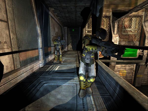
Title: The Legend of Zelda: Twilight Princess Platform: Wii, GameCube
Developer: Nintendo
Year: 2006
Explanation: The Wii adventure of Link smells very much like mainstream, but there's that darkness that is spreading around Hyrule. Monsters and wolves disappear, scatter in black particles, arenas are fenced in by transparent, red line forms. That does not only look cool, but you automatically feel like you're right at the center of the minimalistic works of the group Traction. Fiat Homo, Eight Scenes of Human Life or SSRI are only three of their productions that could be associated with this.

Title: Tron 2.0 Platform: PC, Xbox
Developer: Monolith
Year: 2003
Explanation: Besides cubes and ribbons, there's another effect that the demoscene squeezed the last bits out of: hypnotic glow. The game Tron 2.0 (a fascinating and well designed action shooter that unfortunately has drowned a bit in the flood of other titles) appears like a declaration of love to this effect. Everywhere there are glowing, flashing, and shimmering bits and pieces in the minimalistic-designed environment. The game world is textured very scarcely and the scenery belongs to the bright lines. Comparable demos are Moral Hard Candy, the Block Party 2007 Invitation, Sqny's Chromosphere or Candela's "Fairplay To The Queen. Other productions that should not be forgotten in the context are Matt Current's demos Dishes, Ham, Ketchup and Kittens as well as Elektronimusiikkia.
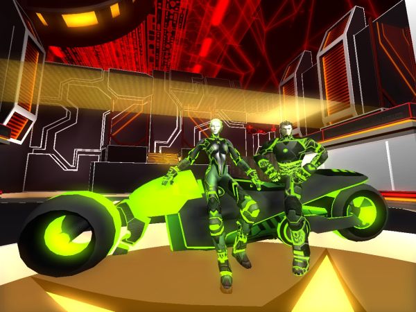
Title: Patapon Platform: PSP
Developer: Sony
Year: 2008
Explanation: Brisk drumming in a paper-like land with loving protagnoists who are making their way through an unconventional world. Very rarely does a game appear that is so different. Same goes for the visuals. The combination of pastel colours and strange shapes oozed of innovation. Which brings us to Andromeda Software Development. The greek demo creators made use of an innovative visual style in their abstract masterpieces Metamorphosis and Midnight Run from 2008. They finetuned that style to the max. Or maybe Sony was inspired by ASD, as objects similar to the Mater-tree were already present in ASD's milestone production Lifeforce?

Title: Spore Platform: PC
Developer: Maxis / EA
Year: 2008
Explanation: Will Wright stated at some point that he admires the demoscene and its creations. Impressed by technical playfulness and ideas, demos or rather, 64k intros, formed the technical foundation for his evolutionary sandbox game with mass-appeal: Spore. Procedural texture generation is the magical term in order to keep the data blocks of the game world as small as possible. The technology that has been used in 64k intros for many years now, allow for the graphics to be created with program code. Memory-intense graphics data therefore is a thing of the past. Countless 64-kilobyte productions prove that, such as pieces by Farbrausch (The Product, Poem to a Horse, Candytron), Conspiracy (Beyond, Chaos Theory), and Fairlight (Meet the Family, Dead Ringer, Panic Room).
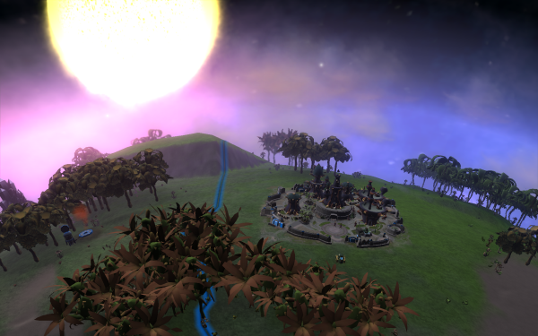
Title: Nanostray 2 Platform: NDS
Developer: Shin'en
Year: 2008
Explanation: Particle effects, tunnels, great light effects, a morphing face, and even spike balls! The effects shown in Nanostray 2 include pretty much every typical demoscene effect. Team Shin'en worked on demos back in the old days. With the shooter for the Nintendo DS they proved that they haven't lost any of their demoscene past. Nanostray 2 displays its muscles in terms of graphics and effects and therefore makes many demosceners happy. Comparable effects can be seen in the demos Tesla, Stars – Wonders of the World, Relic and Mikrostrange, as well as in many other creations from the demoscene.

Title: Darwinia Platform: PC, Mac, Linux
Developer: Introversion Software
Year: 2005
Explanation: The 3d strategy game of the independent label Introversion Software, relinquished the use of modern graphics hocus pocus, and instead staged the deep canyons and steep mountains of the game world in time-honored retro look. At the end of the 1980s and the early 1990's the foundation was laid for this kind of visual presentation. The Commodore Amiga demo-classic Odyssey by Alcatraz from 1991 comes to mind, as it's a 45 minute space saga, that looks like a predecessor of the rasterized landscape in Darwinia. Andromeda Software Development's production "Beyond the Walls of Eryx" also goes in a similar direction, along with the ZINE #13 Headlines for that matter.
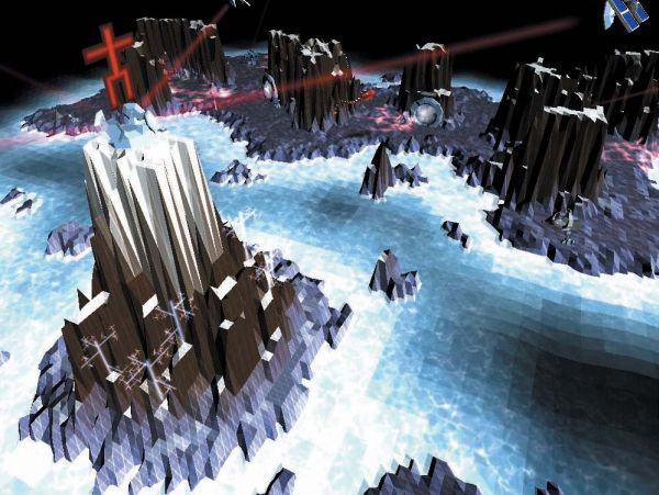
Title: Mr. Nutz - Hoppin' Mad Platform: Amiga
Developer: Neon
Year: 1994
Explanation: It was a truly great game coming out of Germany – Mr. Nutz for the Commodore Amiga (and ported to other platforms as well). The mixture between Super Mario World and Sonic the Hedgehog remains a secret recommendation only, as it wasn't too successful commercially. Not only did it have a few great ideas and challenges, it also featured impressive technology. A fantastic zoom effect was used in bonus levels as well as when approaching end-of-level opponents. This really pushed the hardware (14mhz CPU, 1mb RAM) to the limits but caused players to drop their jaw. The effect written by Chaos of Sanity (Farbrausch these days), already showed off great effects back in demos like Roots, Arts, or World of Commodore.

Title: flOw Platform: Flash, PS3, PSP
Developer: Jenova Chen / Sony
Year: 2007
Explanation: fl0w offers a meditative experience in an abstract underwater world. Even the title is already spelled quite stylishly. The visuals and the audio are going in the same direction. Smells like demoscene spirit all the way. The visual presentation is convincing – albeit strange and daring, but graceful, with its glowing fish creatures. The audio is relaxing but perfectly synced to what's happening on screen. These are the most important rules when you design a demo as well. Striking similarities to demos like Traction & Brainstorm's Challenger Deep or Fairytale come to mind as well as the demo Allius. These are all demos that play with water creatures and micro organisms, but maybe they're slightly more colorful.

Title: Geometry Wars Platform: PC, 360, Wii, NDS
Developer: Bizarre Creations
Year: 2006
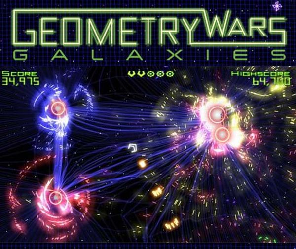
Explanation: Over the last two decades we've seen many different effects in demos. A whole arsenal of them is included in a small but fine shooter that was hidden in Project Gotham Racing 2 back in the days, and which later was offered as an individual title on various platforms. We're talking about Geometry Wars. The title already hints at the fact that the game only features geometric forms and mathematical algorithms that are featured in all sorts of variations in so many demos. Both the spaceship and the opponents could come straight out of a demo like Traction's 25, where all effects are shown in a bluish raster world. Nevertheless there is plenty of movement all around, bright and colorful. The neon world also reminds us of Brainstorms demos like Fascination and Fascination 2, or of Candela's Fairplay to the Queen.
Title: Pinball Illusions Platform: Amiga, PC
Developer: Digital Illusions
Year: 1995
Explanation: The Swedish game development studio Digital Illusions (DICE) originally was founded by members of the demoscene group, The Silents, and earned its first money with pinball simulations named Pinball Dreams and Pinball Fantasties. In 1996 they followed up with a third installment that also was released on the PC in addition to the Commodore Amiga. Digital Illusions never lost contact with the demoscene, and in Pinball Illusions, donuts and rotating cubes can be found in the selection menus, both objects of key importance in the demoscene, and therefore Digital Illusions paid tribute to the demoscene. Even today, representatives of several demoscene teams are working at Digital Illusions, such as TBL, CNCD and Fairlight. Donuts can also be seen in the production Donuts by Half-Bit Cheese. Iso9241 by Still offers halves of donuts and of course Farbrausch's Debris and Orb & Andromeda's Stargazer offer enough of both objects.

Title: Rez Platform: Dreamcast, PS2, Xbox 360
Developer: Sega
Year: 2001
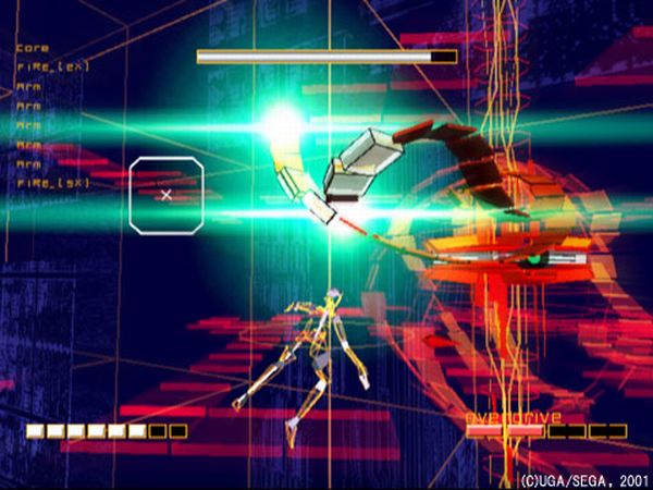
Explanation: "Welcome to Synaesthesia" is the opening sentence that greets players in the shooter Rez by Sega. Was the demoscene group Synesthetics inspired by the shooter when they picked their name? We don't know, but we can definitely say that the game is one of the most unconventional audiovisual experiences in the history of the game industry. The abstract creation of Tetsuya Mizuguchi wants to attract all senses at the same time, which explains why the visuals and the music are perfectly synced just like as in most demos. Demos like Heaven Seven, Iconoclast, and Masagin, demonstrate what can be achieved when the music and visuals are synchronized perfectly. Visually, Rez is taking a different direction though, focusing on minimalism instead of photorealism, very much mimicking Traction's style.
Title: Mario Party 8 Platform: Wii
Developer: Nintendo
Year: 2007
Explanation: Ever since playing Mario Party 8, we do know that even Japanese people know the demoscene in general – and the creations of the group Farbrausch in particular. We wonder, because the development team seems to be impressed by the whole .produkkt-series of demos by Farbrausch (The Product, Debris, and Popular Demo). How else could you explain the fact that the bonus star in the game has the form of a shopping cart which is the group logo of Farbrausch, and which also makes a guest appearance in the greetings-part of ASD's Lifeforce? Could it be that Mario and his friends are secret admirers of the demoscene? You never know.

Go back to articlelist |

