Download PDF version: 
Again, ZINE invited games journalist Miguel Lopez, who already worked for renowned interactive entertainment media such as GameSpot and GameSpy. He comments some of the most well known demoscene productions of recent months.
"I'm starting to get the feeling that
the arrow theme is a little bit played
out in the scene"
|
Candystall by Loonies & Pittsburgh Stallers

Candystall by Loonies and Pittsburgh Stallers
The first movement of this piece brought back some vivid memories for me. When I was about eight years old, my mom used to take me to a children's restaurant called Chuck E. Cheese's, a chain that used to be very popular in the U.S. Part of the way they lured families to these places was by offering a free-play arcade, packed with all the latest games. Since we didn't have much money when I was a kid, my mom would take me there to play games. No one ever noticed that we never bought any pizza, despite the fact that we were there every week. Anyway, the first movement of Candystall reminds me of the first time I saw Gottleib's Reactor. My memories of the game itself are pretty hazy; I think I remember a trackball? But what's always stayed with me was the resounding bass that poured out of its cabinet, whose hits were timed with the pulsating game logo that played during attract mode. Something about that game was very aesthetically coherent, and I think the first few seconds of Candystall hits those same notes. I sort of got bored during the middle movements, though.
Route 1066 by UKscene allstars

Route 1066 by UKscene Allstars
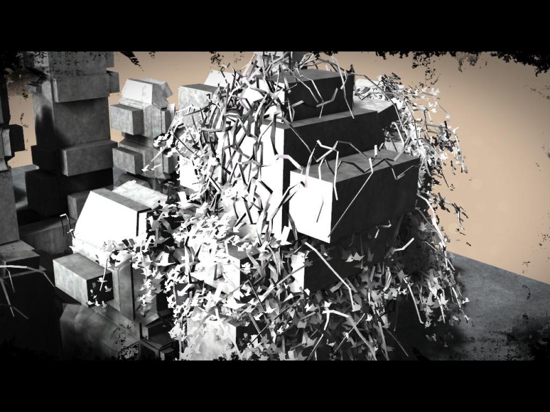
I'm starting to get the feeling that the arrow theme is a little bit played out in the scene, but I think these folks got some good mileage out of it. They're used best when they're made to contribute to a smart, playful optical illusion, suggesting the shapes of birds, falling leaves, fog. I really dig the minimal use of color, though I think we should encourage artists to cast their interpretations of cold, desolate urban environments in something other than black, gray, and white. I think it's pretty cool, though, that one of the few instances where color made a significant appearance was during the "greetz" sequence, with the green road signs. A nice touch; their friends should be flattered.
Ferner by Still

Ferner by Still
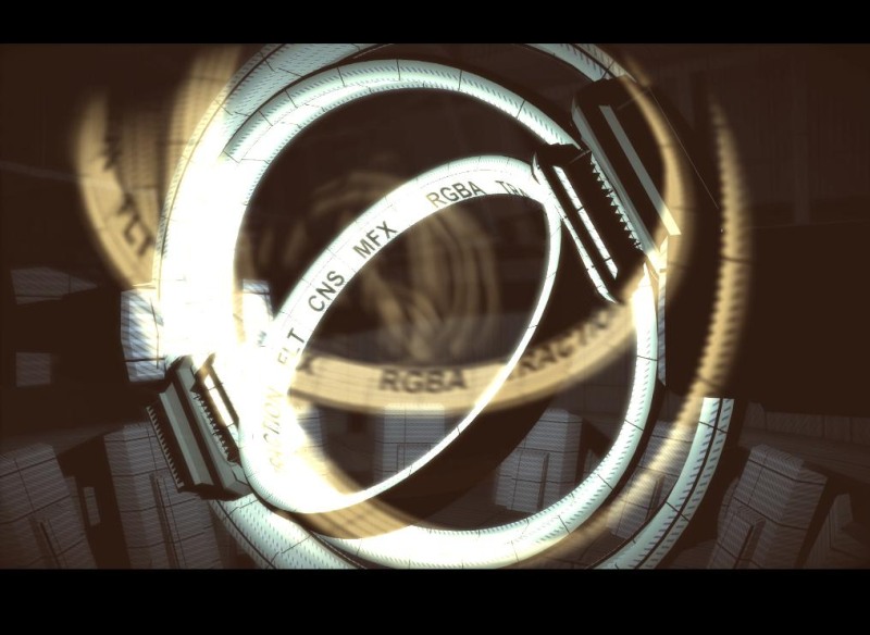
The most visually exciting bit in Ferner was when the swirling forms emerged after a deliberate pass of that reactor-looking thing. There was something fleetingly powerful there, with the contrast between something mechanical and vaguely menacing, and the soft, flowing organic forms that emerged from it. I thought the piece overall was pretty decent from a rhythmic standpoint, but I don't know; it kind of felt like we were taking a guided tour of the Death Star's guts, with only a few noise effects to break it up.
"Ferner kind of felt like we were
taking a guided tour of the
Death Star's guts"
|
Kindernoiser by rgba

Kindernoiser by rgba
Wow, this mighty 4k prod ran like shit on my machine at home, so I had to take it to my office. I'll preface this by saying that I'm almost certain that I'm missing half of what makes this impressive because I can't really grasp what it's doing technically, but it's simply bananas (which is a good thing). The arrhythmic sounds compliment the antics of the living Silly Putty in a way that made me want to touch it and burn it at the same time. I get the feeling iq likes Autechre.
"I get the feeling iq likes autechre"
|
Chromosphere by Sqny

Chromosphere by Sqny
Masterful use of lines, colors, and sounds. I've seen lots of prods that do OK at capturing a theme and delivering it in a cohesive way, but Chromosphere makes most look amateurish. Themes that you would normally scoff at--like the overt use of all-seeing eyes and amorphous space-age cityscapes--seem fresh when rendered by sqny's hands. Don't really know what else to say; this is quite inspiring, sophisticated, and clearly the work of people leagues ahead of their contemporaries.
"Chromosphere is inspiring, sophisticated, and
clearly the work of people leagues ahead
of their contemporaries."
|
Sweet Home Under Synthetic Clouds by Cocoon

Sweet Home Under Synthetic Clouds by Cocoon
I get the feeling these guys are gamers, due to prevalence of cliches in the piece. I don't mean to be a hater - it's clear they have skills. But as a result of my work, I'm saturated in certain kinds of images, and when Axel asks me to check out the products of the scene, I'm looking forward to something more refreshing. For one, I propose that you fellows cut it out with the radiation and biohazard symbols, and perhaps also with the arrows pointing nowhere. There are ways to comment on the toxic effects of global capitalism without resorting lazy shorthand. I could also do without the "spooky little girl" images; I got my fill in Bioshock. Finally--and it may come of as hypocritical, given how crazy I was about a similar image in Chromosphere - but I'm kind of done with futuristic cities. If you've played Metroid Prime 3 and remember SkyTown, you'll know why.
"I propose that you fellows cut
it out with the radiation and
biohazard symbols"
|
Go back to articlelist |

