|
|
|
|
|
|
|
|
by Facet of Brainstorm, Foreword by Axel of Brainstorm
|
Foreword
Look and Feel is a new section in ZINE we haven't really done in earlier issues. This shall become a place where artworks will be discussed and reviewed by Facet of Brainstorm. While many of his comments will surely be received as provocations, it also must be kept in mind that it's an opinion only, although a very professional one. For those of you not familiar with him: Facet is a Dutch graphics artist who became really popular on the Amiga for his works in groups like Vision, Anarchy, Lemon and TBL. His works appeared in countless demos such as Anarchy's Hardcore, In The Kitchen, Legalize It 1 & 2, Seeing is Believing, Lemon's Announce or Groovy and his title pictures for magazines like R.A.W. or Stolen Data were very popular throughout the scene. Facet now is a co-owner of a web agency where he works as creative director. We hope you'll contribute to this section, dear reader, and we look forward to receiving your artworks that you want to have discussed. Send them to ZINELookAndFeel@gmail.com.
A letter to the scene
Dear scene,
To be honest, I am very disappointed of the quality of your artists these days. I know I have been away for many years, but where are artists like Cougar, Lazur, Hof, Made, Danny, Louie, Uno and Mack? I really dont get it. You got more colors, more pixels, more tools but surprisingly I have to conclude that you have become spoiled! For god's sake, I knew kids who were at the age of 13 who could do better stuff on an old Amiga with their eyes closed and with only 32 colors to work with. You should be ashamed of yourself.
Maybe you became lazy and decreased the level of quality because you got more of everything. I know the PC scene never had many great artists especially compared to the wealthy Amiga scene. Of course there are a few dudes doing great stuff on their PC and most of them were probably old Amiga guys. Apparently, they somehow never gave enough inspiration to the youngsters though to keep the chain closed. I always got inspiration by looking at fellow Amiga artists and tried to do "better". This never happened as you know but somehow it pushed my motivation like mad.
I know, I sound like this old guy telling the past was so much better. Still I rather am old and irritating than young and spoiled. Still, if I may, I want to suggest a "plan for improvement". Remove all current tools, unplug your big memory and install the old mighty Deluxe Paint and let your artist first do some old fashioned graphics before they can touch all the current stuff...
Sincerely,
Facet
Introduction
Decades ago I wrote for the section of the legendary Amiga diskmag called Stolen Data (by Anarchy). I got a lot of feedback and many artists sent me their latest work which I reviewed in the next issue. I love talking about graphics and also very much liked the positive and of course also negative letters I received. Now ZINE will start its engines again I thought it would be fun to create a place where people can read and react on scene graphics. I think it can be fun! Therefore I will start to fire up this brand new section called Look and Feel. I know its a dirty job, but someone has to do it. I want to ask all of you to send me work, suggestions, remarks and even hate mails if you like to: ZINELookAndFeel@gmail.com.
First of all, taste is individual, personal, emotional and is comparable to music. Some like it, some dont. Graphics can be seen in terms of theme, color, techniques, composition, layout, statement and sometimes (by rules of the scene) starring a naked woman and a dragon will guarantee you top 3 result in a competition (unfortunately this never happened to me). My opinion is of course just one opinion and therefore these reviews are based on how I look (at) and feel a picture. I can say its based on 20 years of scene experience but I dont know yet whether that's good or bad.
Reviews
Breakpoint Freestyle competition
First of all I found most of the top 10 results for both the Freestyle and Theme category far below average and some even shockingly bad in my humble opinion. Sometimes I wonder how serious some of these so called artists are. I cannot understand the pre-selectors of the Breakpoint party in letting this evil crap air onto the bigscreen. Maybe they didnt have enough entries. In such a case I'd rather prefer having a small list of good pictures than a long list of bad ones. And why has the good old pixel category disappeared in the competition list? Or did I miss something? Has it been shifted into the freestyle one?
And what is wrong with the voters? I assume that those pictures that hurt my eyes actually were voted for. I hope they were only their mates' votes, otherwise we should seriously think of re-educating the scene and their party visitors. Any volunteers willing to write the manual?
Why vote when some work is undoubtedly bad? It's like in politics, if there is no one appealing to you, then why vote? I always imagine this look at a picture as if you want to have it as a poster above your bed. If not dont vote for it. I cant blame the ones who just have a special view on taste you always have some of those and as long as you have a good laugh with them, all is fine. Luckily for us all there were a few guys that actually entered some good work. And those I want to thank!
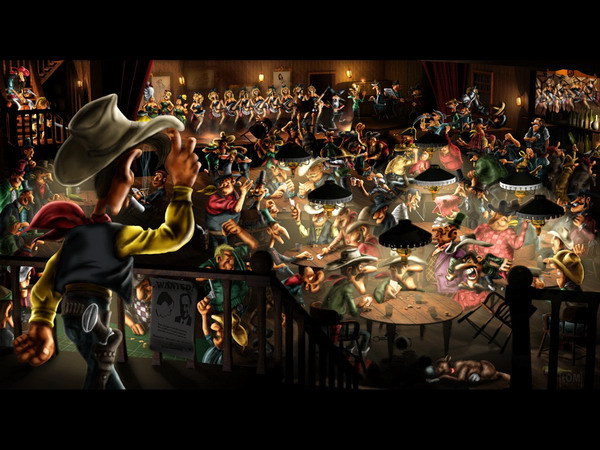
1st - The Roof Is On Fire / Prince of the Obsessed Maniacs Score: 7/10

The Roof Is On Fire / Prince of the Obsessed Maniacs
Likes: This is a very colorful picture with a nice feel to it. The picture tells many stories and everyone who has read Lucky Luke will probably recognize the characters and their stories. I think he did a great job in integrating the 3D object with painted characters. Doing that is usually quite hard to do as one can see the obvious difference in style. I also like the impressive amount of work he put into this. You can see this guy put some effort into creating this picture.
Dislikes: I think its a missed opportunity since it has no real depth of field. Its hard to focus because everything somehow looks blurred and has the same value of sharpness. Perhaps it became blurry when it was scaled -- as I could see that some of the details in the steps pictures had more detail. Also I saw another (highly ranked) picture that had almost the same characters in it. Hopefully next time it will be sharper.
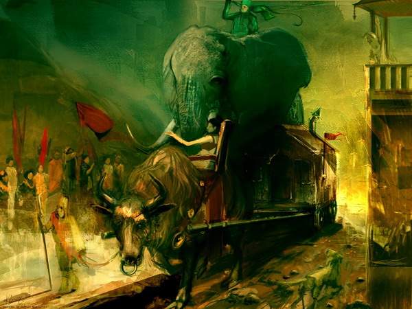
6th - Arrive / Unreal of Kangooroo and Faculty Score: 8/10

Arrive / Unreal of Kangooroo and Faculty
Likes: What can I say? This speed painted picture is just great and shows ** made a truly great painting. Thats what this is : a painting! The picture has all the elements a good painting needs. It has a great composition, rough pencil stripes, nice color scheme and great techniques. Maybe it would have been nicer having more detail but frankly I always find it more interesting to see some of the sketches remain instead of a 100% worked out painting. I can imagine some of you dont like it because of the roughness but personally I wouldnt mind hanging this over my bed.
Dislikes: The lack of detail perhaps but not worth mentioning and before I forget, I dont like the fact it wasn't ranked higher in the compo! Somehow it has little to do with the old pixeling as that is a totally other league in my opinion. Its a great picture but has, in my humble opinion, not that much to do with the scene.
Thats all from Facet for this issue. Send your work to: ZINELookAndFeel@gmail.com
Go back to articlelist |
|
|
|

